I want to dedicate the last post of the year to Webclerks, as events-wise, it was one of the highlights of the year.
Webclerks is a non-profit organization that has been organizing Webckerks Meetup since 2016. This year, for the first time, they organized a 1-day conference. And despite how difficult is to get something right the first time, the organizers did a great job.
They wanted this conference to be a small, fun event with great content and great people, and sure it was! The environment was friendly and welcoming, full of the positivity and diversity that they stated in their code of conduct. The small details make the difference: they had different kinds of milk, bio snacks, and provided the attendees with a crystal bottle that we could refill. Also, lunch was held in Badeschiff, a restaurant where employees are from Food Without Borders.
They also thought about accessibility and inclusivity. When registering, they asked for your pronouns and put them on your badge, as well as offered you the possibility of wearing a red lanyard if you didn’t want to appear in the photos. Also, the talks had real-time subtitles, the toilets were not divided by gender and it was accessible for wheelchairs.
But what made Webclerks special was the passion for web design and development of the organizers, that managed to put together an amazing lineup.
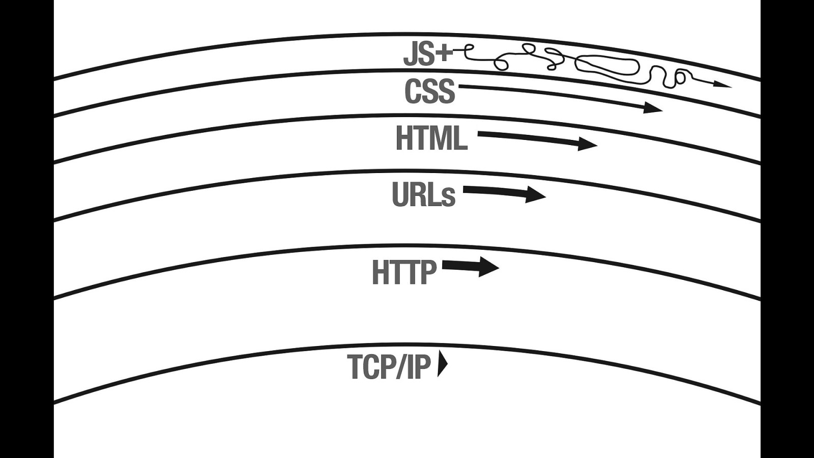
Building
Build websites, brick by brick
We started off the morning with Jeremy Keith talking about how many concepts of architecture are used for web design. The idea of how the Pace Layers layers apply to the web was very interesting.
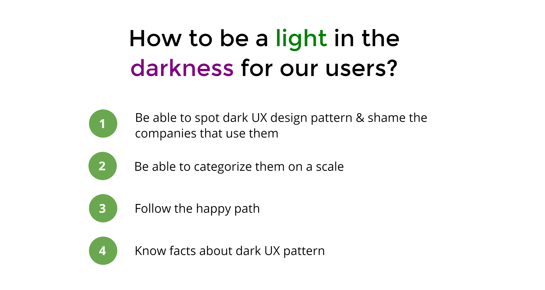
Dark UX Patterns
Be honest to the user
Lisa Gringl did a great job summarizing all the Dark UX patterns that are used nowadays, and that we should not only avoid but be able to spot and shame the companies that use them.
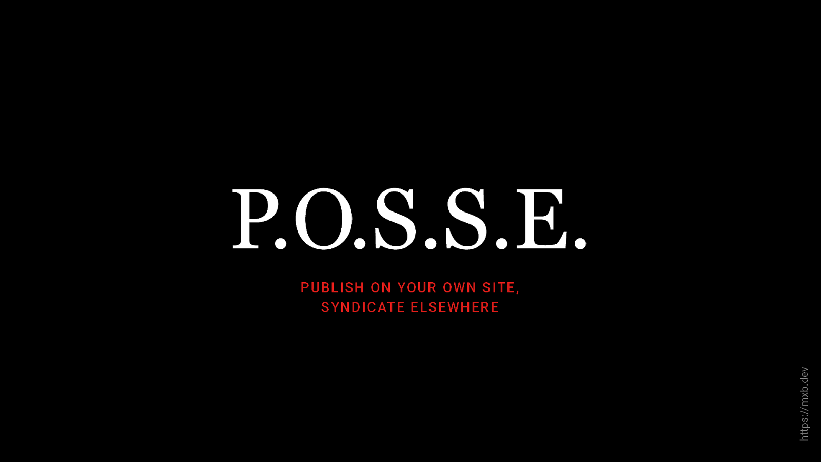
Rage Against the Content Machine
Take the power back, start owning your content
In the next talk, Max Böck did an amazing job showing us how, with a bit of effort and the right tools, we can escape the content machine and control our content, even on Social Media.
Why Every Interface should be Black and White
Is colour making worse the UX of your web?
Heydon Pickering gave us 6 reasons why every interface should be black and white. Being forced to become colour independent and understand when the colour is not only not helping the user, but confusing him, is a great way to think more about accessibility.

Stakeholder – Centric Design
Empathy and sharing knowledge is key
In his very first talk at a conference, Che Harvey explained how we can help our organization to work better and improve processes. Empathize with the stakeholders (what do they want?), making knowledge available and not underestimating the power of legacy (too much innovation may be upsetting, and change creates anxiety) are the key to growth.
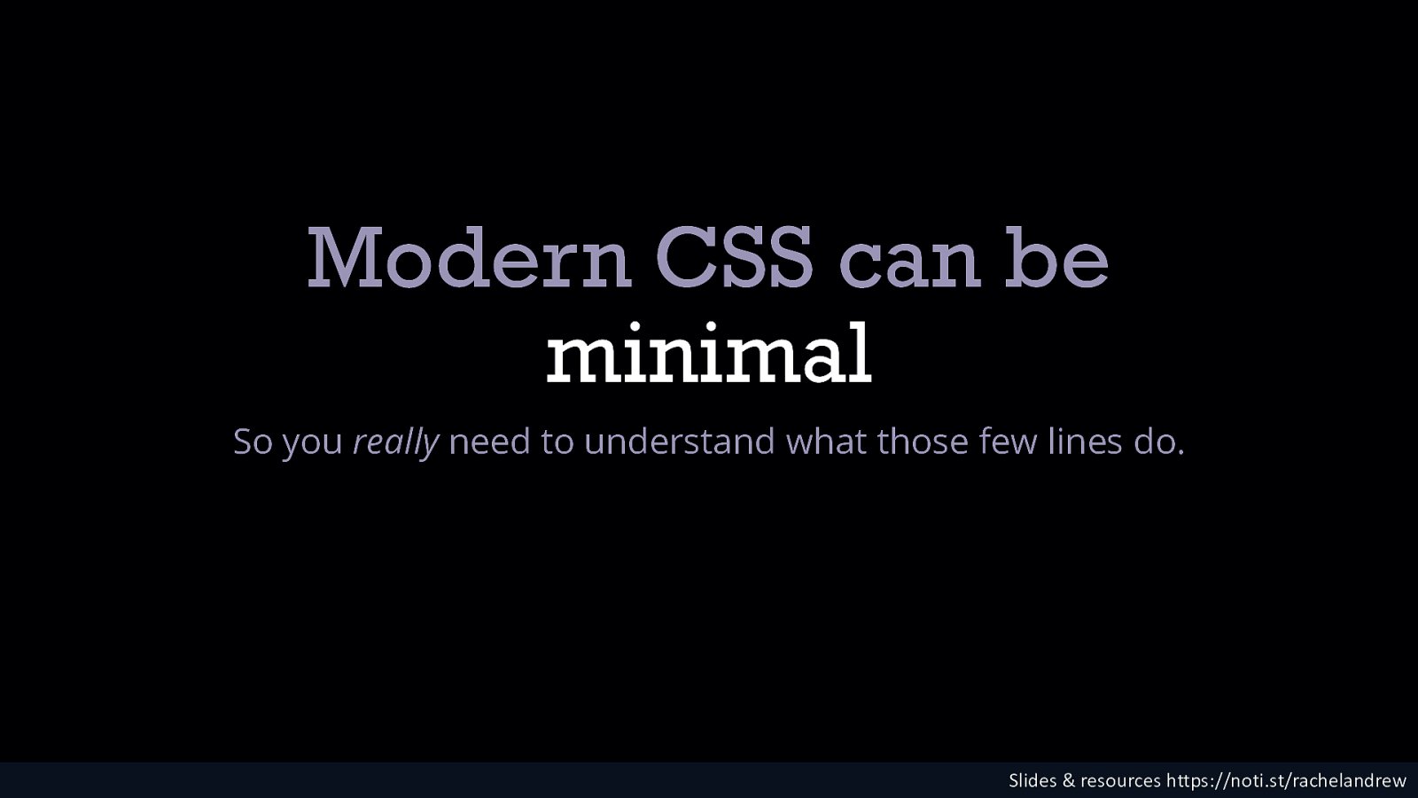
Does it work? Using The New CSS Layout
Make sure you are asking the right questions
Rachel Andrew took a look at CSS in a holistic way, analyzing how important it is to look first at the patterns we need to build to be able to choose the CSS we need to use.
I’m an Old Guard Dev in a New Guard World
Keep communicating
Charlie Owen’s talk was a journey in time where she shared her experiences in the tech industry in the past 20 years, talking about the web of the 90s (the beginning of CSS and JavaScript, the battle of browsers…) and how that evolved to what we have today: user preferences & OS integration, accessibility, web fonts, JavaScript frameworks…
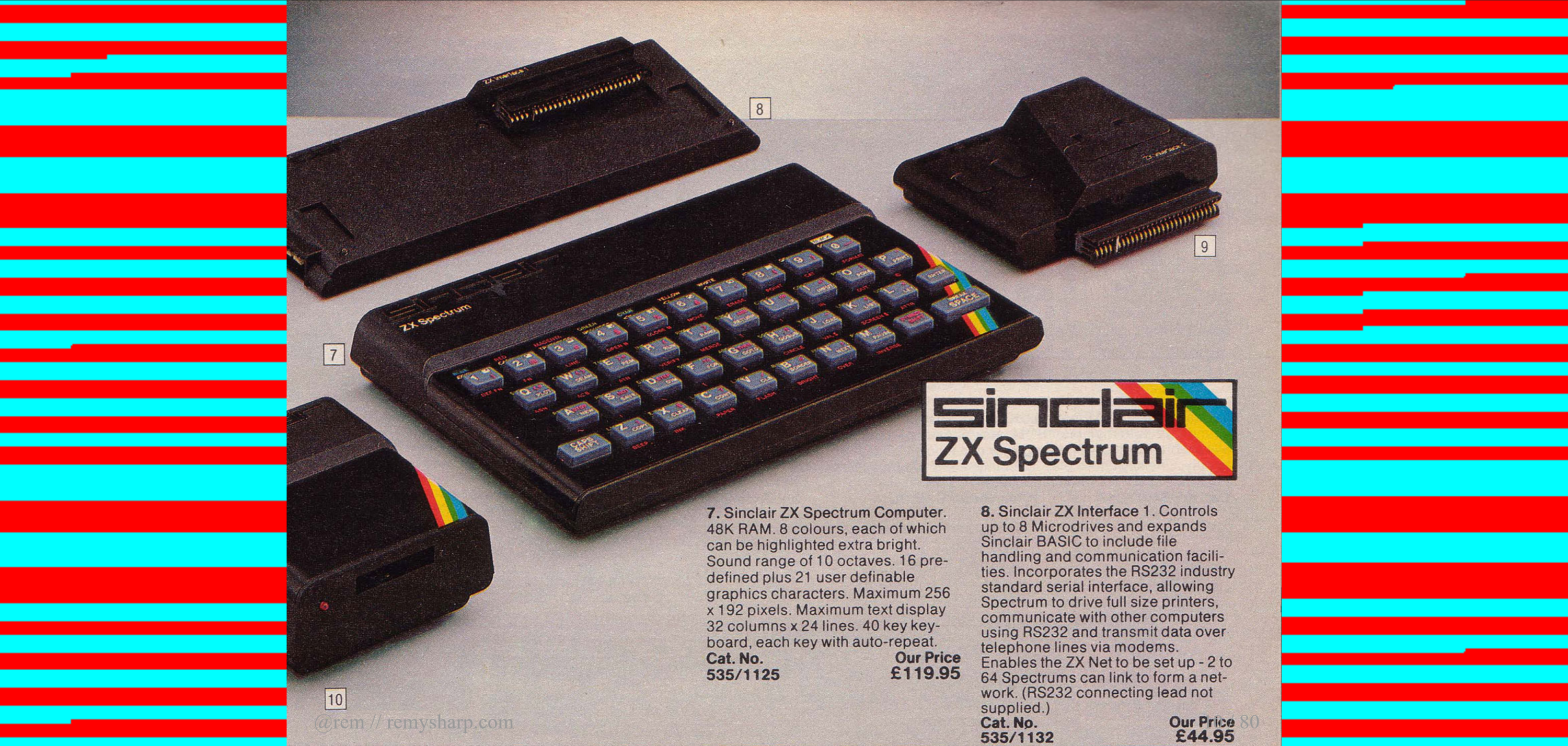
Using Modern Web to Recreate 1980s Horribly Slow and Loud Loading Screens
Challenge yourself
Remy Sharp showed us his amazing project of rebuilding the Spectrum-style loading screens using a modern browser. At the end of the talk, he took a photo with his phone and uploaded it to the browser, loading it as if it was a Spectrum game (watch how in this video). A good way to challenge yourself is to experiment: do not ask “Why?” but “Why not?”
Bring Personality Back to the Web
At the end of the day, it is about showing who we are
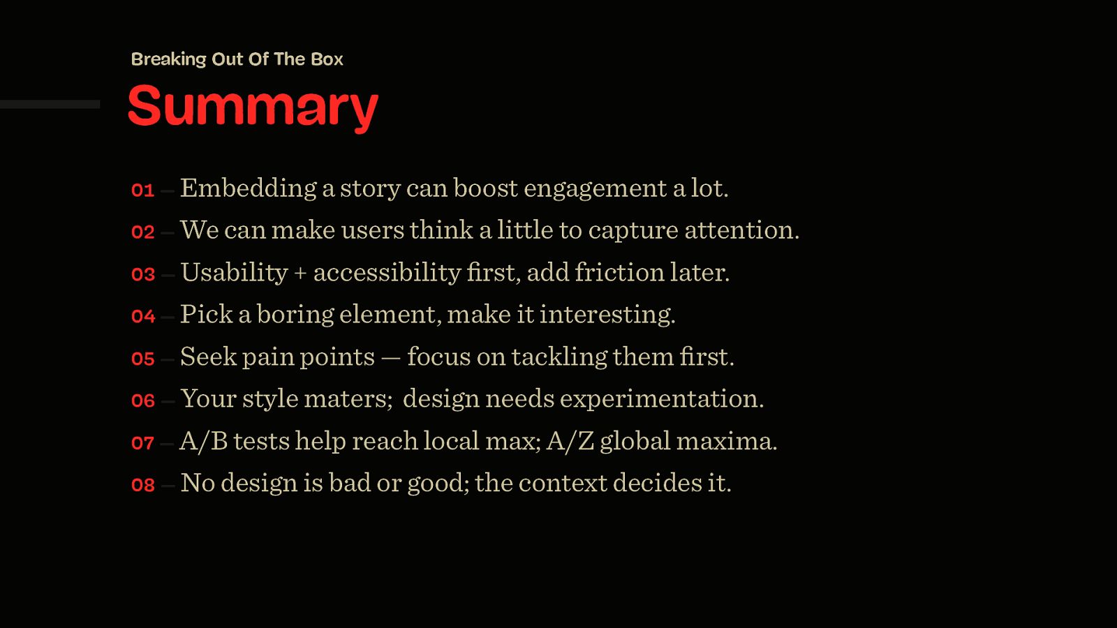
The final speaker was Vitaly Friedman from Smashing Magazine. His talk illustrated how a little bit of creativity goes a long way in making an experience memorable. The web is becoming too generic, we rely on what works because we do not want to lose time.
This may develop in users not having loyalty to the brand (if all the apps are the same, why should they choose you?). But we haven’t forgotten how to stand out, we just need to dedicate a bit of time to think out of the box and not be scared of making the user think a bit. The best way to start is to take a small thing and make it interesting. We have to be authentic, provide values and stand behind them.
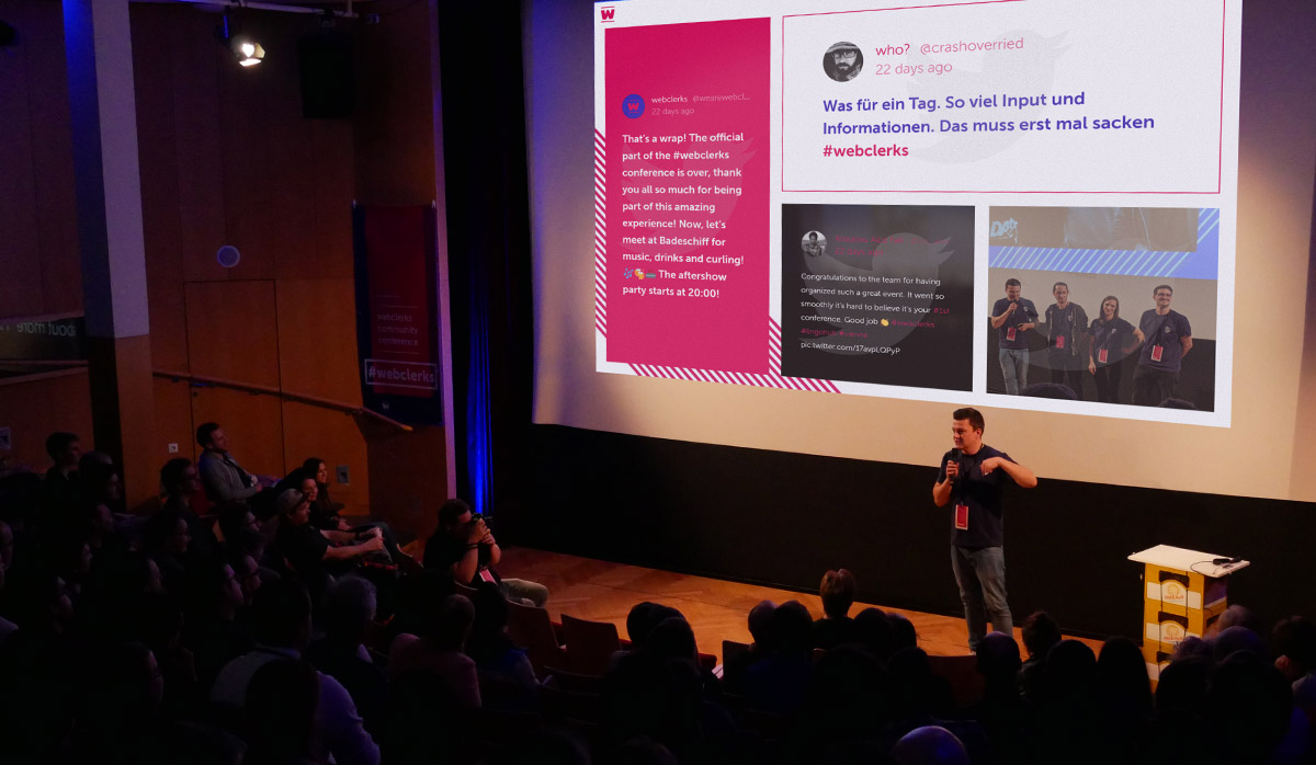
Also, Walls.io was sponsoring the event and we had a social media wall there, which means that we published a showcase about it!